Beautify your sales: tips for outstanding UX design
The target group's user experience is a decisive success factor in e-commerce. Creative and well thought-out UX design can have a positive impact on the user experience and transform interested parties into buyers.

What is UX design and why is it so important?
Good UX design is essential for digital touchpoints such as online shops to create an optimal user experience. This not only includes colors and shapes, but a holistic and sustainable user experience. Strategic planning of action sequences and interaction possibilities is an important part of the process. Only a well thought-out and coherent overall concept can ensure pleasant and smooth interaction processes across all shop pages.
Strategically approach UX design right from the start
Good UX design is not about perfecting colors or pixel-precise subtleties, but about the user experience. Optimal usability always has priority over appearance and creative gimmicks. What’s more, this should not just be taken into consideration incidentally, but right from the start. It must be clear who the target group is and how they should interact with the online shop. Good UX design always requires a strategic planning process and a structured approach to user guidance:
- With what intention and expectations do interested parties visit individual pages?
- Which interaction possibilities are offered?
- How should the conversion funnel be designed?
These questions can be answered precisely using experience maps. Experience maps form an excellent foundation for the design process. This should include definition of all usage scenarios, from the initial contact with the online shop to the checkout process. Therefore, important clues can be defined for UX design, dead ends can be avoided from the outset and clear user guidance can be established.
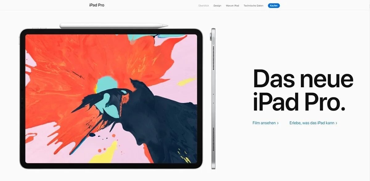
An excellent example of first-class user guidance can be found at apple.com:
Simplicity wins in UX design
“Keep it short and simple” and “Less is more”. These two rules of thumb are the be-all and end-all in many design disciplines and UX design is no exception here. After all, a good user interface should be understood by every user as quickly as possible. Otherwise frustration and, in the worst case, a high bounce rate can occur. Online shop pages should be as simple and clear as possible. This type of design helps users grasp and classify the provided information faster. The following applies in this regard:
- The fewer interaction possibilities offered, the easier it is to find your way around the online shop and the easier it is for shop operators to manage the flow of users.
- This applies not only to links, buttons and the like, but also to the content on the site. The tidier and clearer a page appears, the better the usability!
- Interaction elements should always catch the eye. They can be visually separated from the content using special attributes such as colors, pictograms, underlines and defined areas.
The ZARA website is an excellent example of good, clean and intuitive UX design.

Responsive design is key
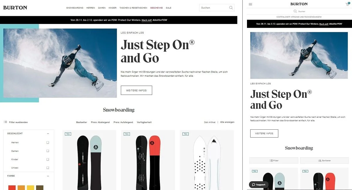
An optimal shopping experience across all devices is also an important sticking point in UX design for e-commerce. Users should be able to interact equally well with an online offering, whether they are using desktop devices, tablets, smart phones, TVs or even wearables and IOT products. The UX design process is therefore always responsive. Details such as the size and spacing of buttons on small displays are particularly important.
Burton’s online shop has an impressively clear UX design that is optimally designed for responsive use:
UX design means staying consistent
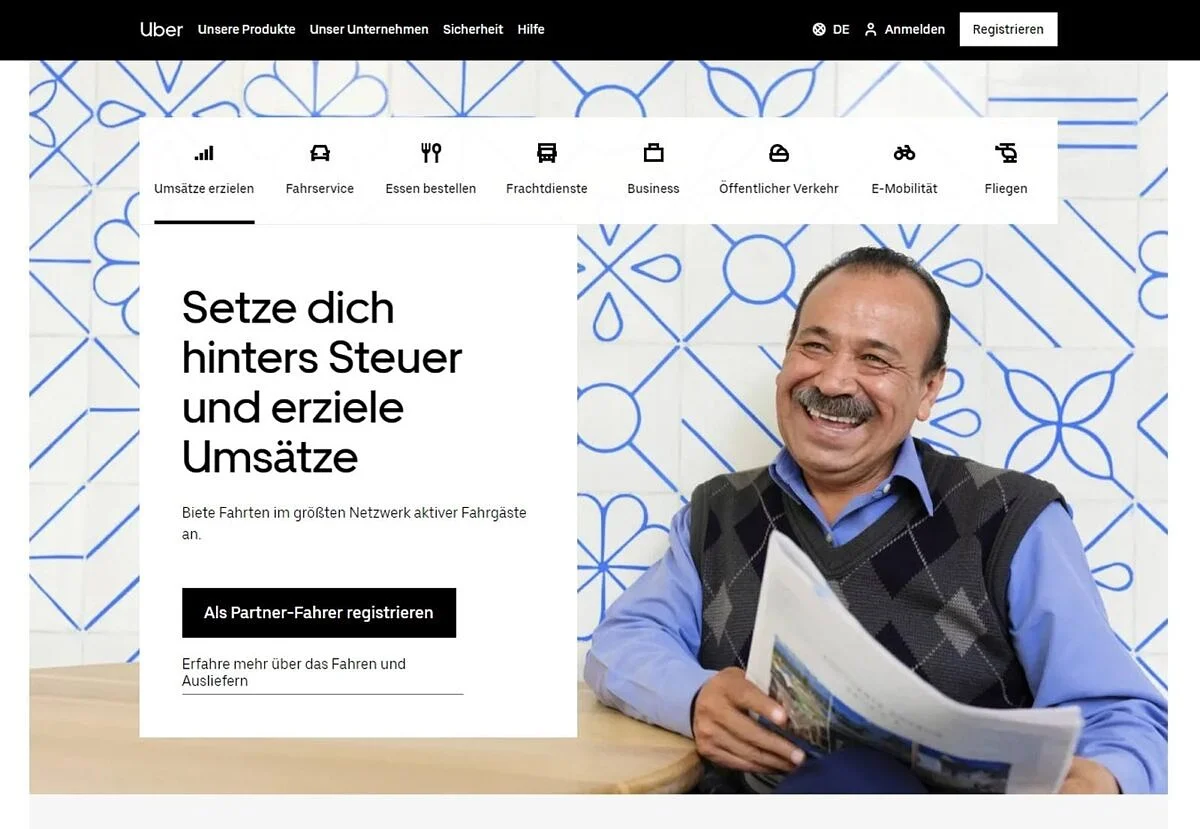
Good UX design improves the brand experience and that requires uniformity. The design of certain elements and areas should be the same across all sub-pages. If, for example, a certain color scheme is used for call-to-action elements or a certain positioning of form fields is chosen, this should be implemented at every point. Uniformity creates a high level of recognition and ensures that users can interact smoothly with an online shop. Elements with the same function always have the same design! To document this, the design of all recurring elements should be defined and cataloged using design patterns.
The uber website implements a uniform and exceedingly clear UX design:
Communicate clearly and use common patterns
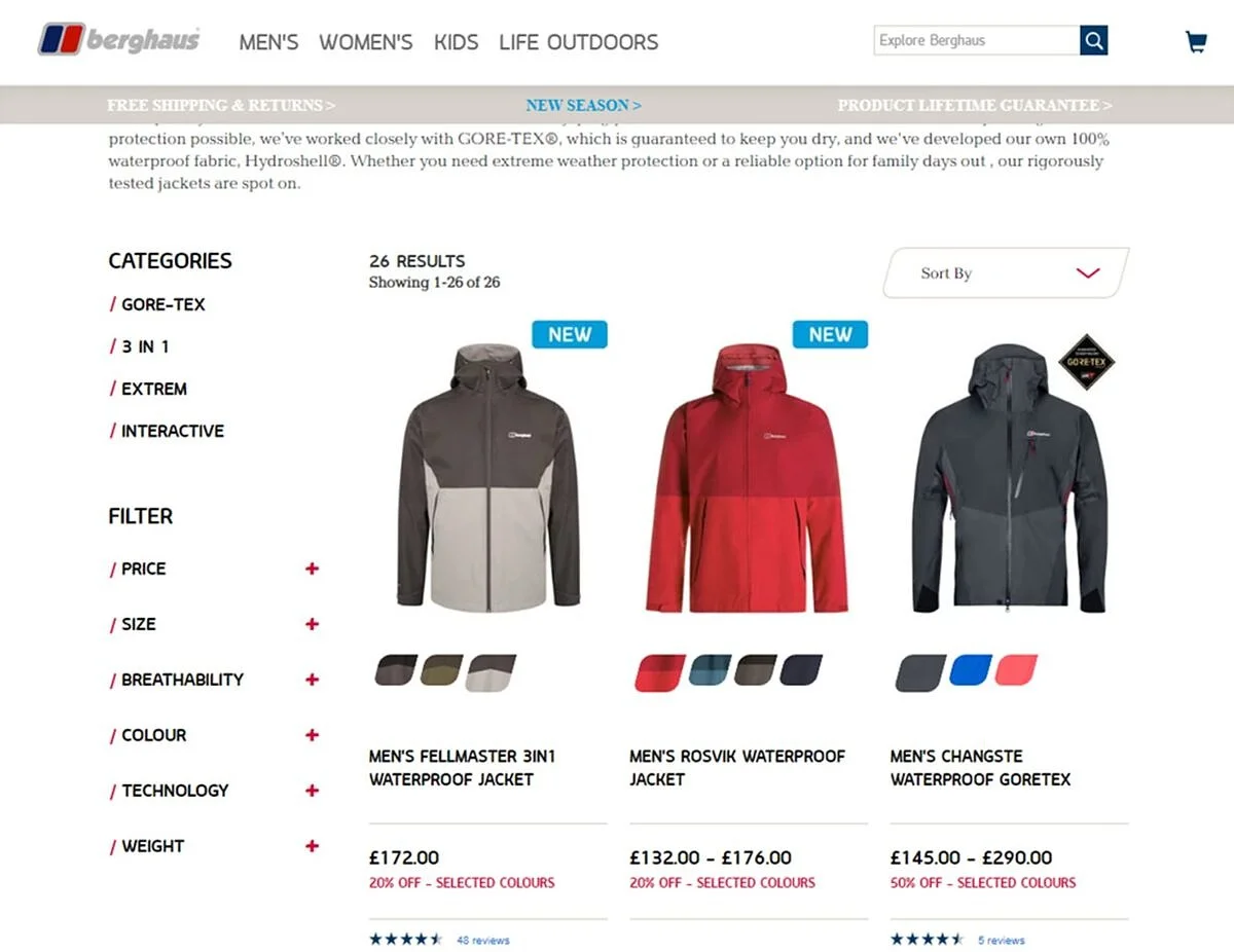
When designing online shops and shopping apps, the wheel does not have to be reinvented, nor should it be. Many users expect common interaction scenarios. This includes a typical website structure with familiar navigation and important elements such as the shopping cart icon or order buttons at the usual positions. These elements make the shop intuitively understandable and easy to use for most users. What always counts is clear communication. All interaction elements should make clear what their purpose is. Instead of using labels such as “Next” for a button, designations such as “Complete purchase” provide clarity.
The interaction elements used on the Berghaus online shop, for example, are intuitively understandable and yet individually designed:
Finally, test, test, test
Excellent UX design is never finished and requires ongoing testing, evaluation and improvement. Regular test runs and monitoring are essential to find out which design achieves the most conversions. Heat maps, A/B testing and various design variants can be used to determine what works best in your own online shop. UX design is a continual learning cycle consisting of three steps: try, learn and optimize.


