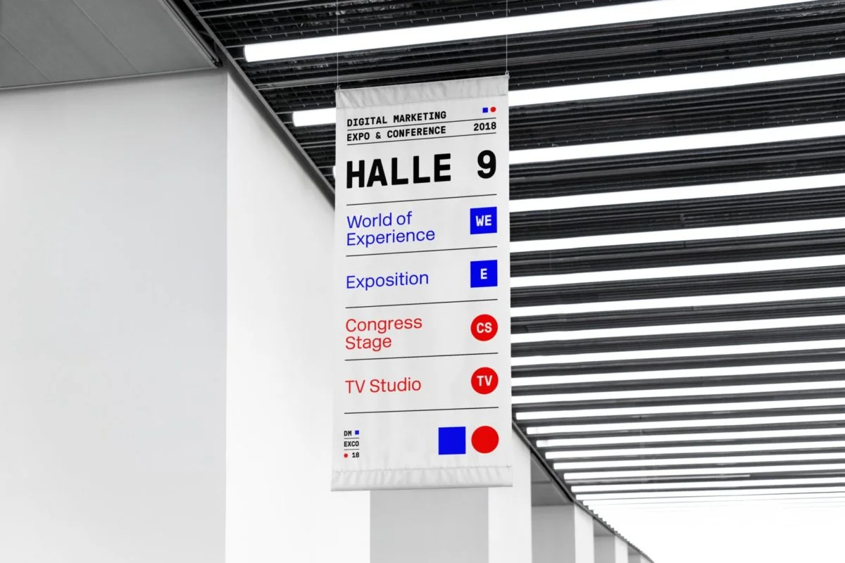
Reach your Destination faster with the new DMEXCO Guidance System
We have been accompanying the digitalization process for around ten years now. Our answer to the vast growth: better guidance!

As a platform for all the important decision-makers from the fields of digital business, marketing and innovation, DMEXCO is and will remain a constant player in an ever-changing and often very fast-moving digital economy. Over this period, the second wave of digitalization has gradually changed and transformed traditional business on an increasingly large scale.
The key data of the Expo and Conference reflect this development: the initial 290 exhibitors have now grown to well over 1,000. The number of visitors, who are offered a program spanning more than 570 hours, has also multiplied. Given the vast growth it has not always been easy to keep track of things.
It’s all about guidance
For the DMEXCO, this means focusing even more on the individual visitors – and thus the potential clients for solution providers – and their needs. Our core interest lies in bringing together global decision-makers from the fields of digital marketing and innovation with the right people and companies. The motivations of the visitors are manifold. The art is to find out what suits each individual best. This is precisely what we have been working tirelessly on for weeks and months. The first visible step in this direction is a new guidance system, which is the result of a thorough revision of our corporate identity.
Blue and red are the traditional DMEXCO colors, but will be clearer and separate from each other in the future. They symbolize the Expo and Conference within the guidance system. The blue square stands for “Expo” and identifies paths, formats and content relating to the Expo. The red circle stands for “Conference”. Both have corresponding analogies: thus square meters usually characterize the exhibition space. The red carpet circle, on the other hand, is the place for the speakers at the TED conferences.
One platform – many goals

The new corporate identity also includes a new font. The New Rail Alphabet is a modern version of the font that has been used in the London public transport system since the 1960s. This font underlines the guidance system with its straightforward, clear shape. Our aim is for visitors to reach their destination in the most direct way possible. Whether at the DMEXCO in September or on the website.
“Platform” – this also means that the community will not only meet once a year in Cologne. In the future it will be about accompanying the decision-making process of our exhibitors’ clients throughout the year. The website will be a central point of contact for providers and potential customers. Here too, the guidance system provides the basis for orientation and preparing for a visit to the DMEXCO. Accordingly, colors and symbols mark news and trends in the blog as well as all content elements, and assign them to the Expo and/or Conference. So try it out for yourself right away and look for the key aspects of the Expo or the first highlights of the Conference Program.


