6 tips for user-friendly online forms in online shops
Good online forms can make the difference between customers making or canceling a purchase. Improve the usability of the web forms in your online shop with these tips.

Cancellations at the checkout – why you should optimize your online forms
The checkout is the most crucial moment in online shopping: Will the buyer complete the order process and click the buy button? Experience shows that the cancellation rates for online shopping are high: on average, only two or three out of 100 visitors to a shop actually make a purchase. There are many reasons why visitors cancel a purchase. Many find the shipping costs too high or their preferred payment method is not offered.
In a global Statista survey of online shoppers in 2017, 20 percent said that ordering was too complicated. One in ten thought that ordering took too long. For the checkout process this means: everything that makes it easier and faster for customers is an advantage. This is especially true for online forms.
Most people find filling in web forms annoying or laborious – especially on smaller mobile screens. This is why badly made forms can be a reason why shop visitors cancel their purchase on the home stretch. Follow these six tips for online forms to improve usability in the checkout process, reduce the number of canceled purchases and raise the conversion rate.
#1 Ensure a clearly arranged layout
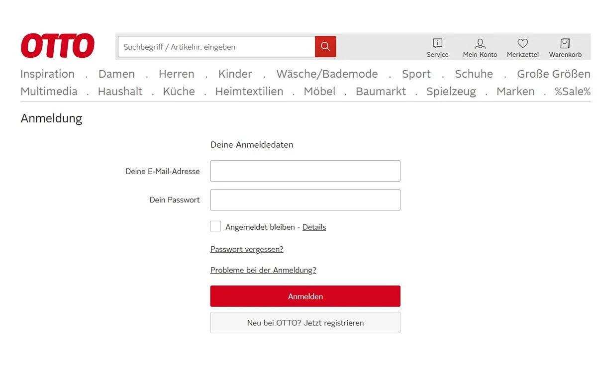
If online forms are confusing or too long, many users are put off. Usability experts recommend ensuring sufficient space between the fields, so that the eye can get its bearings more easily.
#2 Remember: less is more
From the user’s point of view, one thing is important above all: filling out online forms, an already tedious task, should be quick and easy. That’s why shops should avoid anything that is not necessary. That means:
- A clear arrangement of the fields, preferably left-aligned, because this is easier for the eye to capture on mobile devices. Another benefit: users don’t have to scroll to the right.
- As little distraction as possible from a busy background, frames or the color scheme.
- It is also advisable not to ask for too much information during the first customer contact. This can be a deterrent. Therefore, keep the number of mandatory fields to a minimum.
#3 Ensure clear and succinct wording
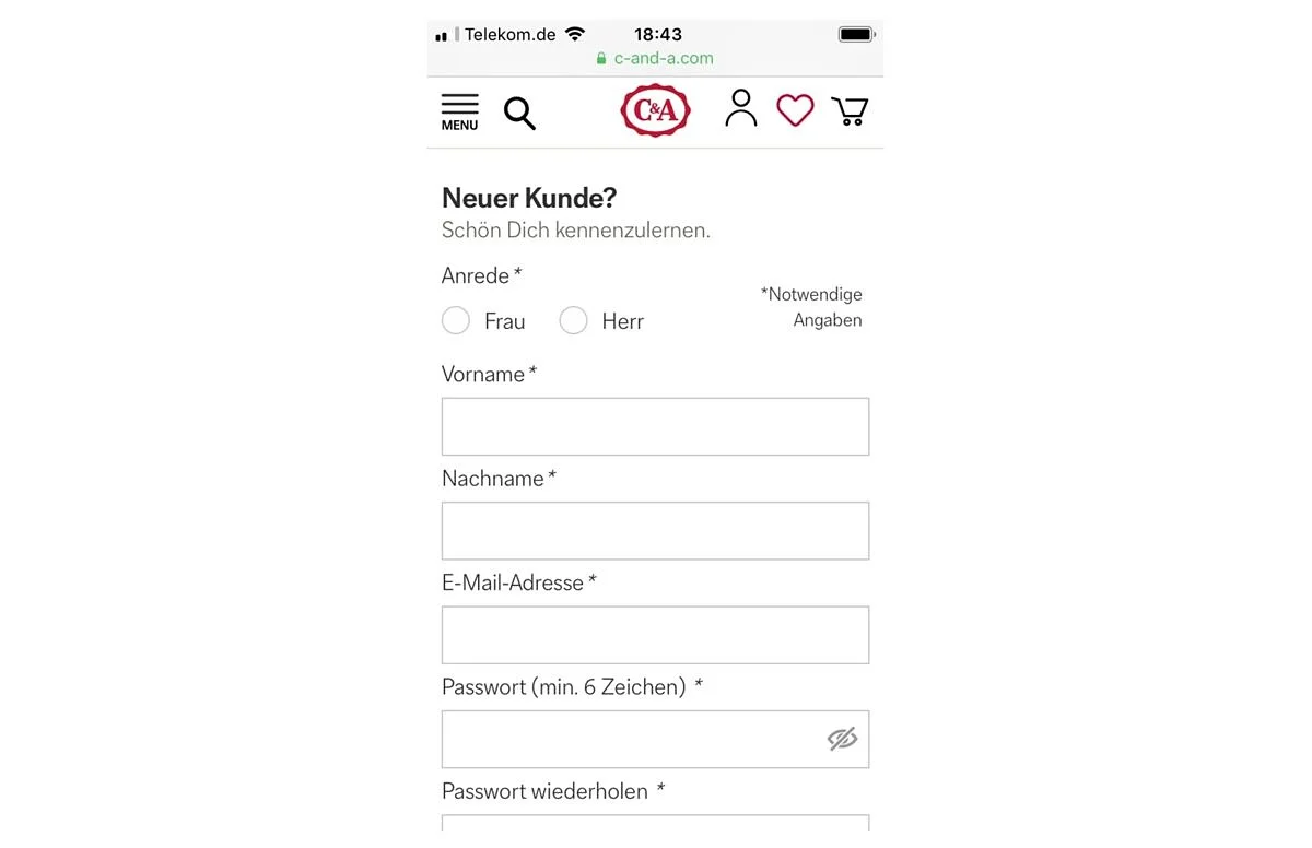
Clear and succinct wording begins on the web form itself. Headings such as “Register” or “Buy in just a few steps” make it clear to the visitor what he or she is currently filling in.
The fields themselves should also be labeled precisely to give a clear indication as to what information the buyer needs to enter. For example: Does “name” mean only the surname or also the first name? Or both in one field?
#4 Incorporate a progress indicator
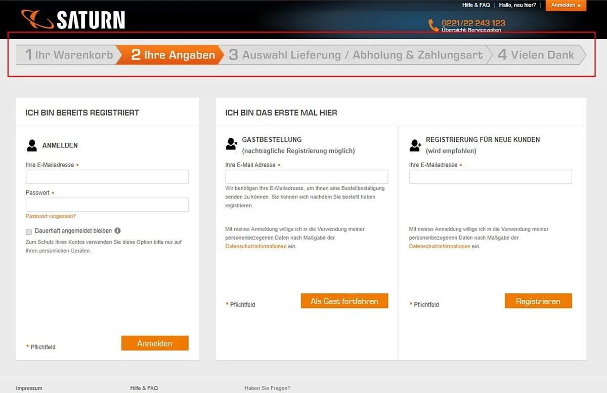
We are familiar with this feature from online surveys: a progress indicator shows how much of the path lies behind and ahead of us. This creates transparency. Such a progress indicator also helps the user to fill in online forms in the checkout process: Do visitors have to fill in a very long form that requires them to scroll down? It will be more nicely laid out if the data request is divided into individual steps. In this way, you can also visually highlight where in the process the user currently is.
The progress can be illustrated by various means, for example by naming the number of steps (“Step 2 of 5”), incorporating a color bar representing the progress made (“60 percent completed”) or by marking the individual steps already taken in a different color.
#5 Use the advantages of validation
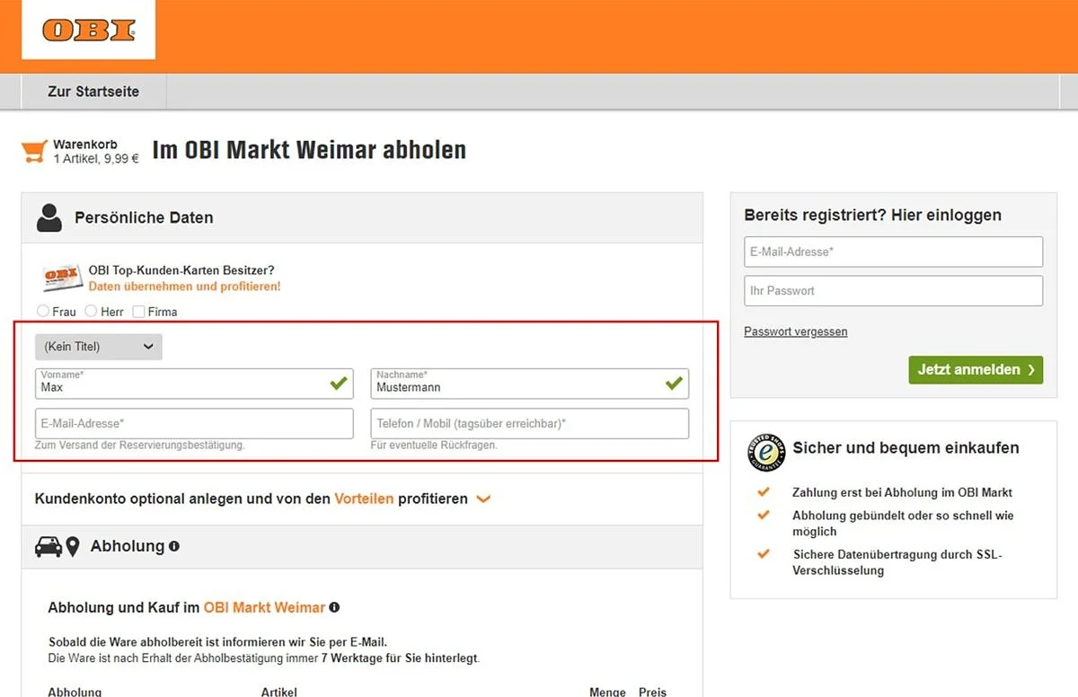
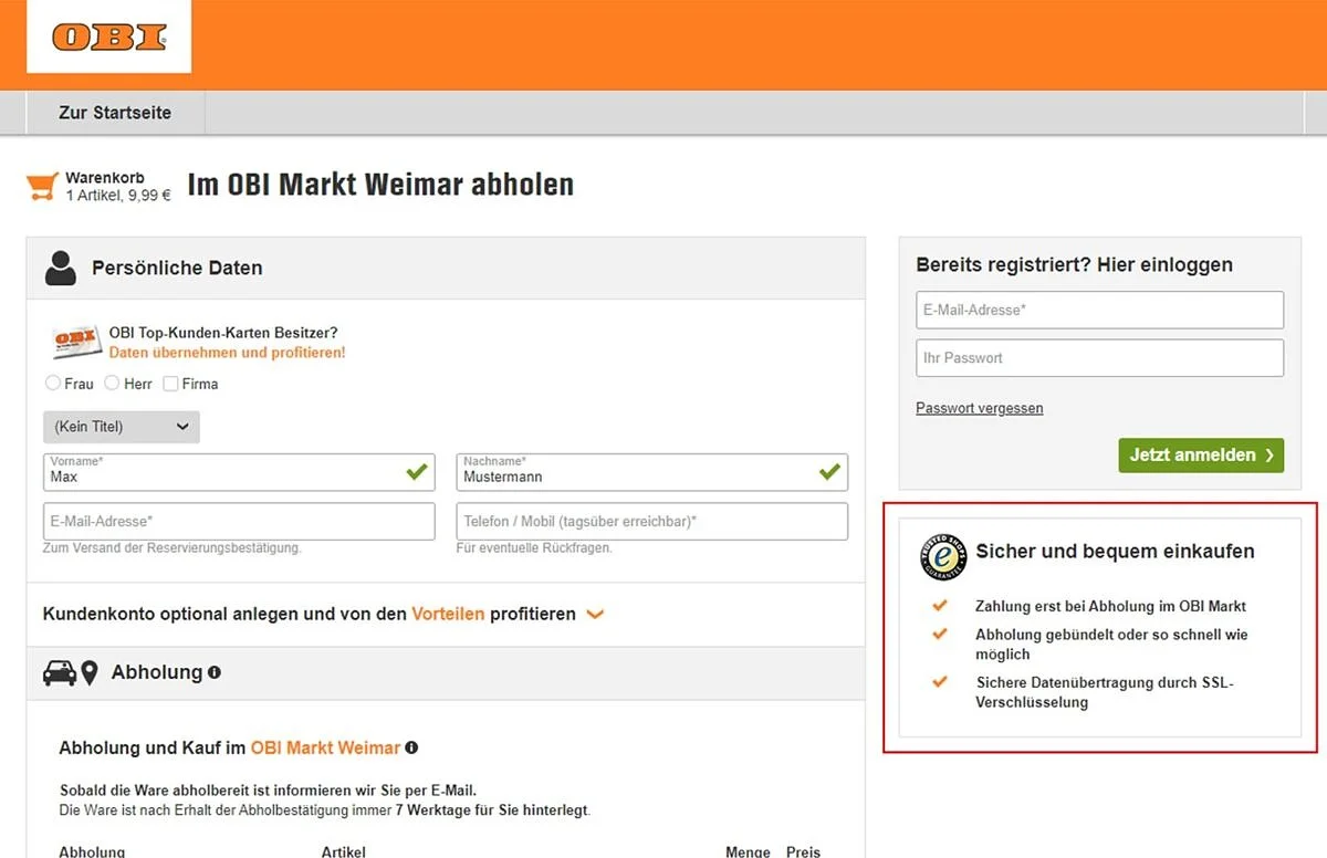
Input validation means that you confirm to your customer that he or she has filled in the individual fields of the online forms correctly. A green tick appears immediately to the right of the field as soon as it has been filled correctly. This has two advantages: the customer receives confirmation and encouragement that he or she is doing everything right. This increases their motivation to fill in further fields. And: checking whether an entry is valid as soon as it is entered reduces the error rate.
#6 Strengthen confidence
The questions “What happens to my data?”, “Can I trust this shop?” and “How secure is my data?” are what move customers when shopping online. At the checkout, shops can do a lot to show that customers are making the right decision with their purchase. Make it clear to your customers that your shop is trustworthy and that their data are secure, for example by displaying a quality seal for your online shop and a note that the data are transmitted in encrypted form.
There is always potential to optimize online forms – and it’s well worth it. Make the checkout more user-friendly, reduce the number of canceled purchases and increase the conversion rate for the long term.


